How to optimize the effectiveness of your presentation: Quick tip #4
Prioritizing importance
Our last few quick tips focused on ways in which presenters can successfully engage their respective audiences, and while props, slides, charts, and so on, can be extremely helpful in achieving this goal, it is crucial to remember that the most important part of any presentation is the PRESENTER him/herself. More often than not people fall into the trap of relying too heavily on their presentation accompaniments, or having those accompaniments upstage them, and you want your audience to remember YOU in the end…not your slides.
Quick tip #4: Your are the star…Not your slideshow!
When thinking about how to approach presentation accompaniments, things that should merely enhance presentations as opposed to defining them, go in with the idea that you want them to impress, but not upstage or take attention off of you. If you chose to do a slideshow, let’s say, design your slides with uniformity and consistency. Make them look great, but not in a way that will take the focus off of you. Remember, YOU are the real star of the show! Keep a consistent background, use the same font size and placement of titles, and then you will have a great presentation where you remain the center of attention from beginning to end.
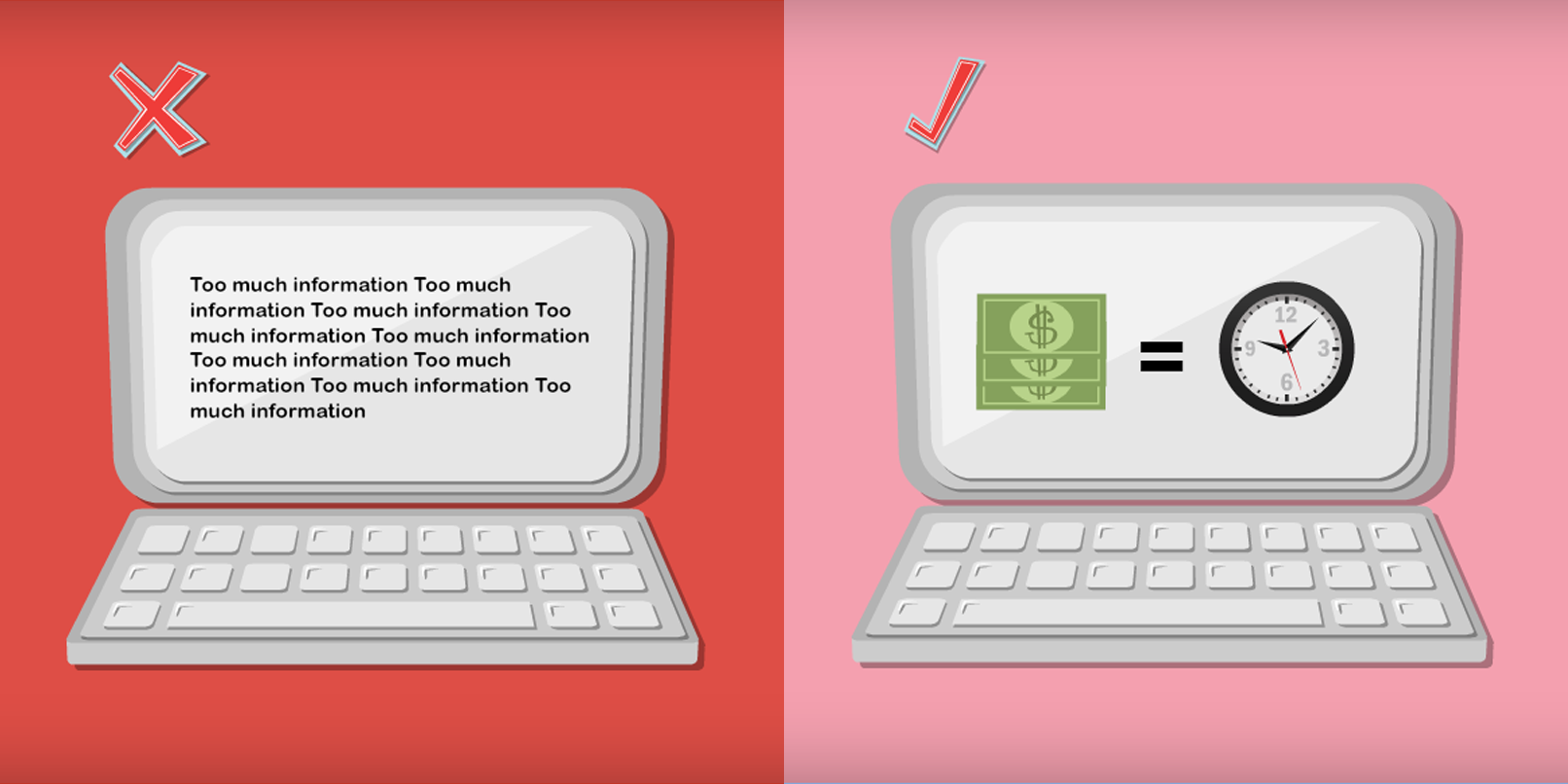
Here are two pictures illustrating a poorly designed slide, and an effectively designed slide:
As you can see, the placement of the words on the left hand slide, combined with the different fonts being used, are rather unappealing, and can take focus away from the presenter and the presentation itself. I would definitely turn to my neighbor at this point and say “wow that does NOT look so good”, which means I have just missed out on whatever was being said during my rant about visual appeal… Not so good! The slide on the right hand side, however, is simple, visually appealing, and doesn’t detract attention from what might be going on in the foreground, thus proving to be a much more effective presentation aid.
In conclusion, have faith in your abilities as a presenter. Use your presentation accompaniments to help enhance how people view you as a presenter, but don’t let them take anyone’s attention away from you… YOU ARE THE STAR!
Stay tuned for Quick tip #5 tomorrow! (Click here to view the previous Quick tip)
Get started on your next presentation TODAY! Click here to sign up for Powtoon!!
Latest posts by Jordana Pepper (see all)
- The Most Creative Teacher Is… - October 22, 2015
- How To Make Marketing Videos People Will Really Love & Share! - April 28, 2015
- Digital Marketing in 2015 - March 15, 2015
- 5 Steps to Overcoming Stage Fright - March 2, 2015


