10 Design Tips Proven to Boost Your Video Engagement
Design tips are ridiculously accessible these days. But let’s be honest… sometimes the vast array of advice out there can become quite overwhelming — especially to someone who is just starting out his quest in video creation.
But the truth is, it doesn’t matter whether you are a beginner or a pro, we all desire to create something that captures attention and delivers our message. And in the age of visual communication, that means a beautiful design.
So, on a bustling Wednesday afternoon, I decided to interview Powtoon’s very own VP Product & Creative, Peter Berezhansky. I wanted to know the secrets that would actually boost my video engagement.
And, oh my, did he spill some secrets…
Get ready for ten key design tips proven to boost video engagement (Don’t worry! They’re super easy to apply).
Design Tip # 1: Choose the Music First
“In the professional world, we call music a ‘guide track.’ It serves as a reference for feel and tempo. The right music track will keep creative ideas flowing and will help you to create at the right pace.” – Peter

They say music is the key to your soul, so it will come as no surprise that finding the right track is already half of the battle. If you are planning on using music in your next video, Peter suggests you choose the music before you start animating.
“It’s just easier to fit animations to a beat than trying to find the perfect beat to an already existing animation.”
Choose a jam that fits your message and allow the music to be your guide.
Design Tip #2: Colors, Colors, Colors
“One of the MOST important steps in video creation is choosing the right colors! Don’t mix and match too much, and keep in mind that brighter and bolder are not always better.” – Peter
When it comes to colors it’s important to keep two things in mind.
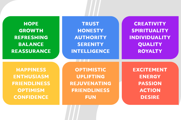
Color symbolism
“Colors speak louder than words” – Peter
Fun Fact of the day: Did you know that colors can subconsciously influence your emotions?
Choose wisely, and the right colors will be the ones to deliver your message! You can use red if you are looking to create a call to action. Blue is known to be a more serene color. It works great when you are trying to deliver important information.
Color palette
“Just because you want to talk about nature doesn’t mean your every slide should be green.”- Peter
Ahhh, God bless color palettes. Let me tell you why they are a MUST when it comes to any type of design. A color palette simply refers to a collection of colors that work well together. Choosing colors that are harmonious will make your video aesthetically pleasing, and make your video even easier for your audience to watch!
If you don’t know how to create one from scratch. No need to panic! Most of us don’t…
There are lots of existing color palettes available online.
Once you have your colors selected, you can always save your favorites for one-click access.
Still feeling intimidated? Simpler is always better. Stick with no more than three colors if you’re just starting out. It’s also going to save you lots of time and frustration…and who doesn’t want that?
Design Tip #3: Font Style
“There’s no need to have ten different fonts in your video. Two or three fonts that compliment each other will be enough. And remember: simple, clear and readable doesn’t have to be boring.” – Peter
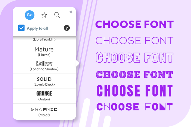
Delivering our message clearly is going to be our number one priority. Choose fonts that are clear and easy to read, like Monserrat, Open Sans, and Poppins. Bad news if you love ornate, romantic, or cursive style fonts.
But I have some good news too. Handwritten fonts like Great Vibes or Indie Flower look great as titles or to put emphasis on a single word.
Remember to keep it simple.
- Choose a readable font
- Stick to no more than two fonts throughout your video
- Play around with bold and text size
One last piece of good news: Powtoon has hundreds of fonts to choose from. Simply select a font you like, or upload your own. You can always click on the star next to your favorite fonts to use them again and again..
Design Tip #4: Safe Frame
“Most beginners don’t realize how important it is to keep a safe frame. It’s simply the secret sauce to every video.” – Peter

Don’t we all love a secret sauce? And guess what? This one doesn’t come with a complicated recipe. Safe frame simply refers to the margins on your slides. Make sure to leave the edges of your slides empty. A quick double-check is all you need. Be sure to use a grid tool to help you keep on track.
Design Tip #5: White Space
“Let your frame breathe and keep elements separated, so a viewer can’t miss anything.” -Peter

Allow your slides to breathe. When it comes to video engagement, less is simply more. Too many bright colors, big fonts, or items on the screen at once can become overwhelming.
Just think of Apple advertisements for a vision of this minimalist approach: fewer words, fewer objects, and the ability for your audience to know exactly what they’re supposed to pay attention to. Always remember that the white space in the background is your biggest ally.
Design Tip #6: Text Length
“Videos are not for reading, videos are for watching.” – Peter
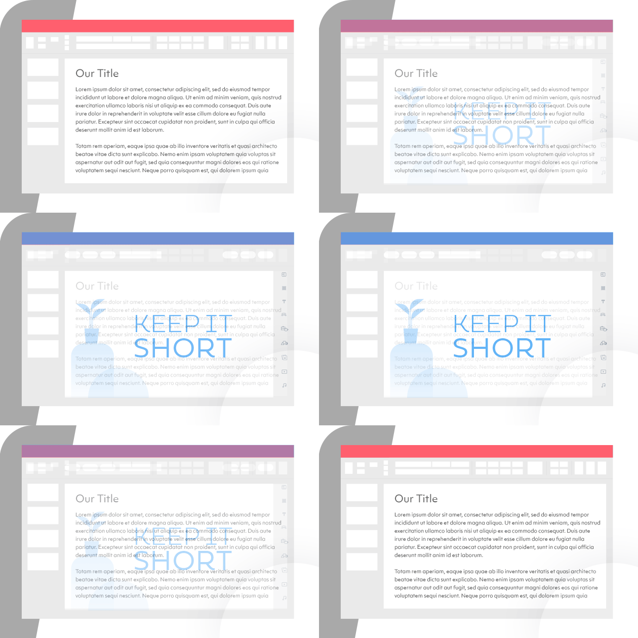
I will say it louder for the people in the back!
Keep your sentences SHORT. Nobody wants to read endless information in a video — that’s what we have boring emails for.
Do you have a lot to share? No problem. Peter suggests you include a voiceover. You can upload a pre-recorded one, or simply click on the voice recorder tool to record yourself right in the studio..
Design Tip #7: Video Length
“As a creator, you always need to put yourself in the viewer’s position.” – Peter

Eight seconds.
That’s how long the average adult’s attention span is.
Short and sweet is the ONLY safe strategy here. A one-minute video is more than enough for most circumstances. But I hear you say, “My training video NEEDS to be ten minutes long!” Here’s the answer: break that video up!
A ten-minute video can also be a 10-video playlist filled with short, sharp messages that your audience can’t miss. Trust me on this one. Cut your learners some slack and create a bunch of short videos instead.
This whiteboard explainer template is one of our most popular templates (and it’s only 50 seconds long). Feel free to try it out!
Design Tip #8: Animation
“In a video, the viewer’s attention is always drawn toward movement.” – Peter

Animation will be the center of your viewers attention! So don’t just animate everything and anything.
Whether we’re talking about the transitions between slides, the entry and exit effects of your text or props, or the poses your characters take, too much movement can distract the viewer. A video with too little movement, however, can become boring.
I’m sure you know where I am going with this… Yes, yes, a healthy balance is key here.
Design Tip #9: Alignment
“Alignment might not look too important, right? But unaligned elements cause viewer discomfort and distract from your message.” – Peter

Alignment, alignment, alignment. This one should be obvious, but it’s easy to overlook. Be sure the objects and text on your slides are aligned with each other.
Once again, the grid option to the rescue! But if you’re tired of aligning by hand, select multiple items and align and distribute them in one click.
Design Tip #10: High-Quality Images
“Look for images with better quality. Blurred or pixelated images make your videos look unprofessional.” – Peter

We’ve all been there. Searching for high-quality images can be super time-consuming. But good images are simply the bread and butter of video creation.
Yes, it’s that important. Bread-and-butter important!
And for Peter’s sake… If you are planning on uploading a logo, choose one that doesn’t have a background. Better yet, use one you or your team has designed themselves with our Canva integration.
We’ve Got Your Back
And here you have it: ten of the most effective design tips guaranteed to take your videos to the next level.
Breathe! You got this.
And if you need a little help, to save some time, or just need a little inspiration, remember to check out all of Powtoon’s templates. These video templates are created by professional designers who kept all of these tips and tricks in mind, and optimized and used by over 30 million people around the globe.
Hannah Elishevitz
Latest posts by Hannah Elishevitz (see all)
- 3 Key Strategies to Maximize Your Market Share During the Great Rationalization - October 23, 2023
- The Top 6 Training Topics for Sales Teams in 2023 - October 12, 2023
- Sales Enablement in 2023: Key Statistics and Insights - October 9, 2023
- The Best And Newest B2B Lead Generation Strategies in 2023 - October 3, 2023
