How to optimize the effectiveness of your presentation: Quick tip #7
Daydream Prevention
We, as presenters, really want to show off the fact that we know what we are talking about, and want to strive to give off the impression that we are “experts” in what we are presenting. While this is no crime, it can often lead us into the trap of overloading our audiences with superfluous, even irrelevant, information that they really don’t need. It’s great to be prepared, it’s great to really know your topic, but it is equally as important to have the ability to weed out information that isn’t absolutely necessary to give. It is quite possible to be thorough and detailed while still being succinct and straight to the point.
Quick tip #7: Don’t overload your audience with T.M.I. (too much information)
Most of us normal people out there don’t have the ability to retain exorbitant amounts of information at one time. In fact, our working memory, and attention span, are very limited in their capacity. This can cause a big problem if you overwork that which is only meant to function at a certain level. If you push too much information onto your audience they will begin to shut down and focus on things more reasonable like their grocery list, what to wear on their next date, household chores, and so on. An example of information overload could be filling your presentation accompaniments with paragraphs of text or an extensive amount of bullet points, which is perhaps the worst thing you can do as a presenter. NOBODY wants to read all that crap!! Trust me. Would you? Plus it is very hard for audience members to read while simultaneously concentrating on what you are saying, and if you remember back to our last quick tip, YOU need to be the center of attention, not your slides. Another thing to remember is not to overcrowd your slides with too many images, because that can confuse and overwhelm your audience just as much as incorporating too much text into your presentation.
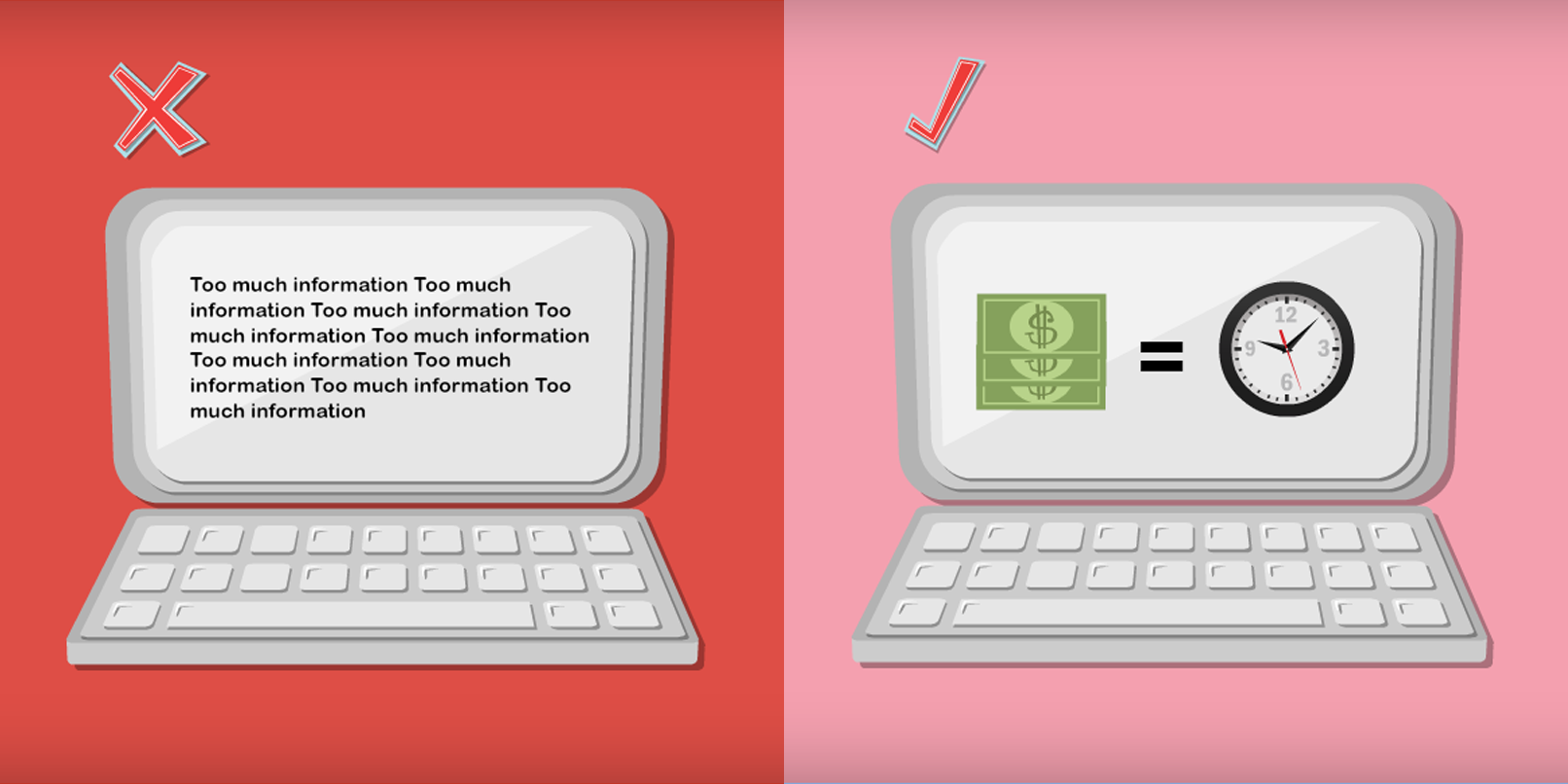
As you can see, the slide on the left hand side simply has too much going on… You will completely lose your audience if this is the kind of material you present to them. The slide on the right, however, is simple, it uses images which don’t detract too much focus from you, and it is easy and fun to grasp. Also, remember to keep each slide focused on ONE idea or theme.
Stay tuned tomorrow for Quick tip #8! (For the previous Quick tip click here)
Why waste another minute! Start your next presentation NOW by signing up for Powtoon!
Latest posts by Jordana Pepper (see all)
- The Most Creative Teacher Is… - October 22, 2015
- How To Make Marketing Videos People Will Really Love & Share! - April 28, 2015
- Digital Marketing in 2015 - March 15, 2015
- 5 Steps to Overcoming Stage Fright - March 2, 2015


